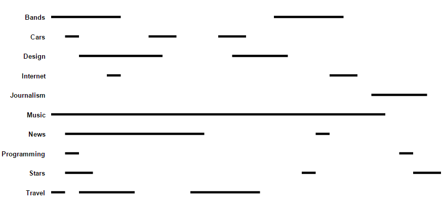
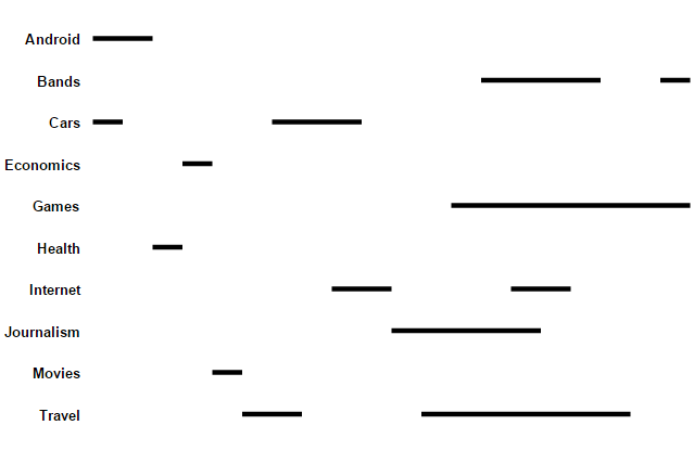
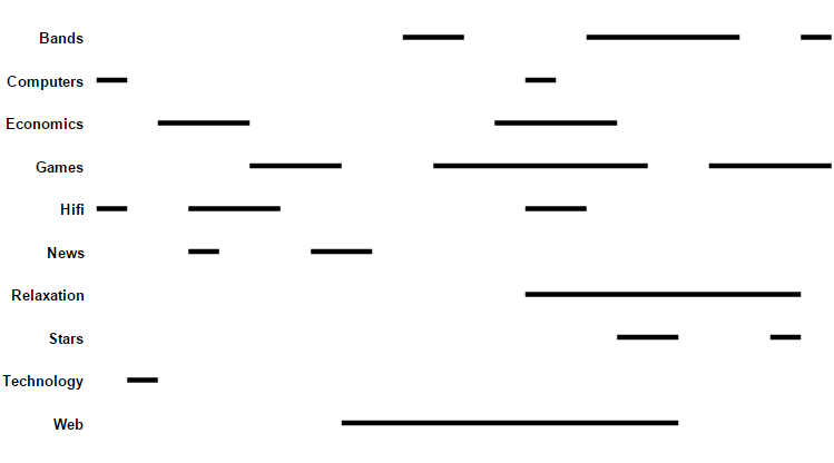
Set:
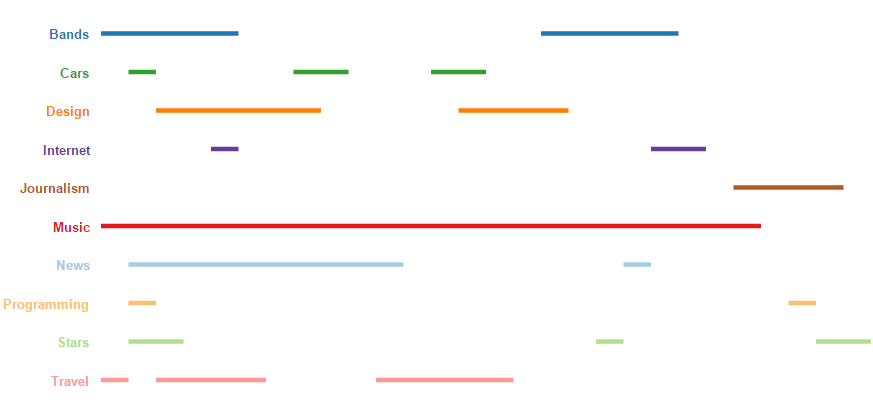
Overlap:
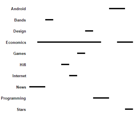
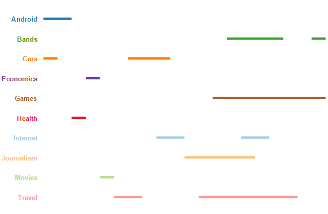
Set:
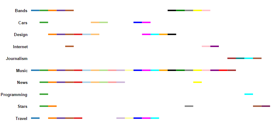
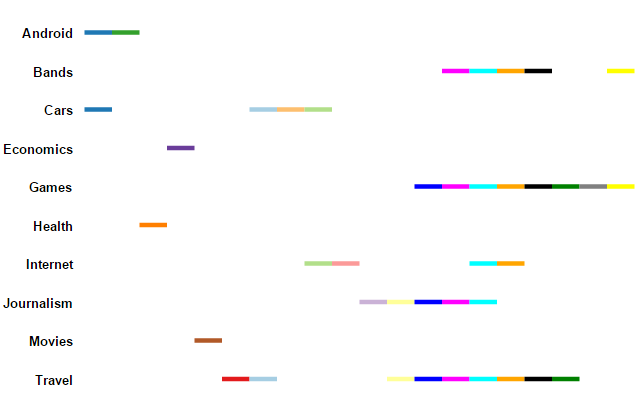
Overlap:
Set:
Overlap:
Set:
Overlap:
The work described here is part of a larger study on the design of linear diagrams.
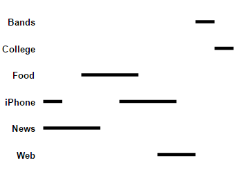
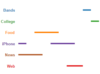
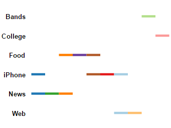
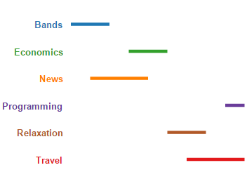
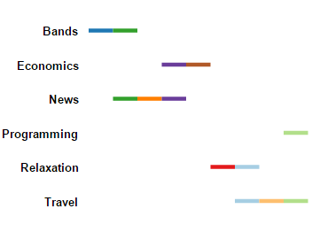
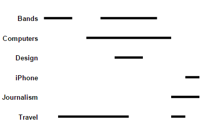
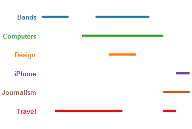
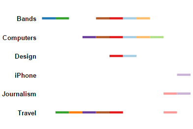
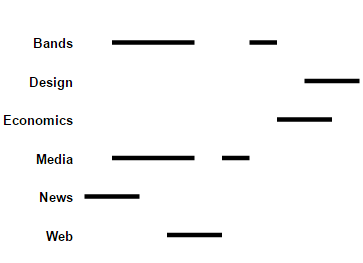
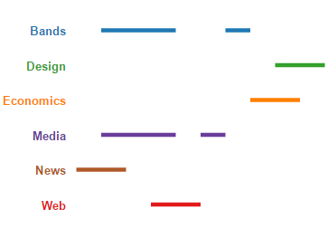
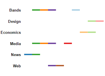
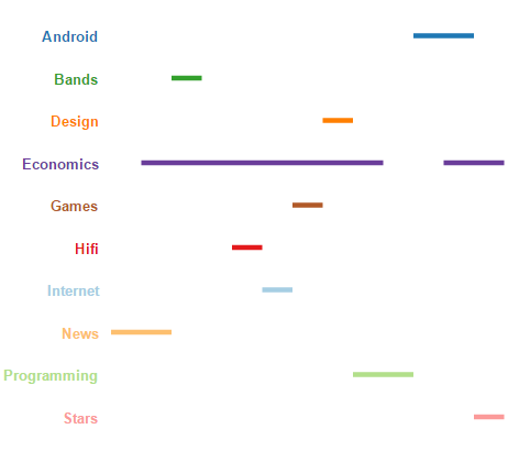
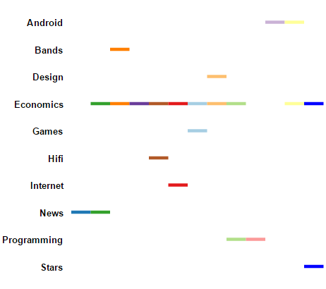
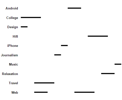
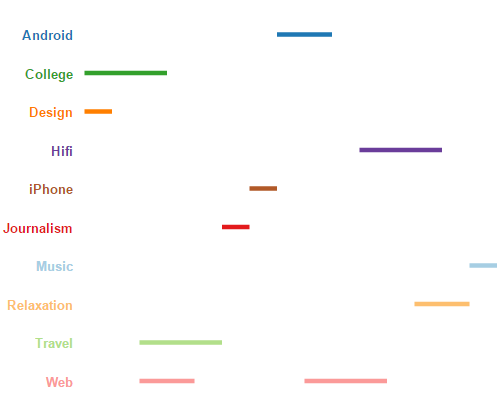
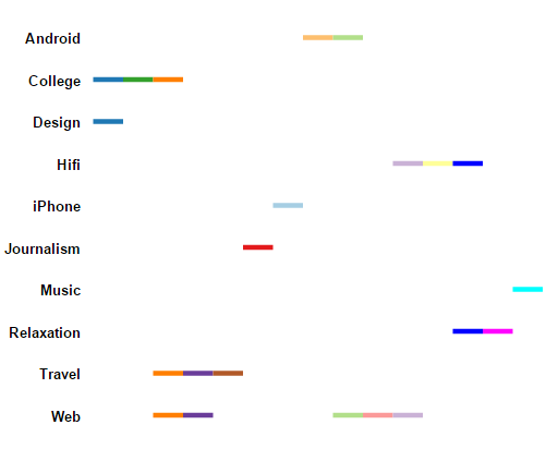
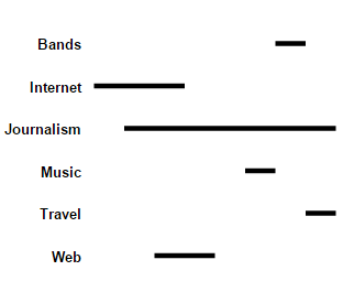
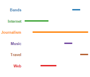
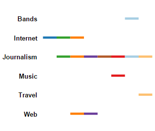
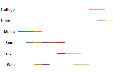
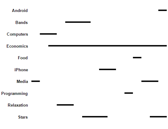
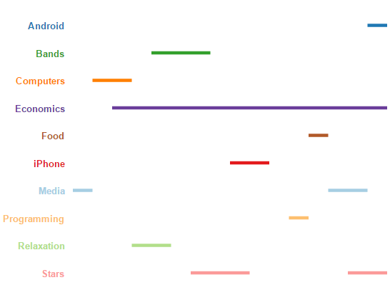
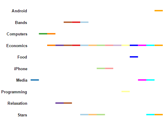
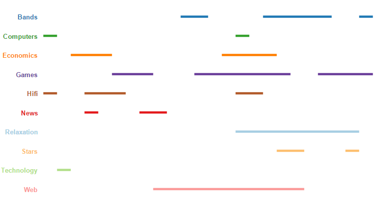
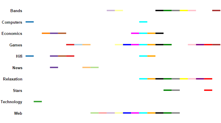
Design Study Part B. How should we treat linear diagrams with colour: assign black to each set, assign a unique colour to each set, or assign a unique colour to each set intersection (i.e. overlap)?
Here the questions are presented in the random order, as they would appear to the participants. The pages below echo the results, in the study, these answers were sent to Mechanical Turk in a url query string.
Diagrams and Questions:
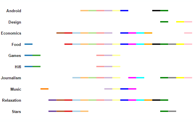
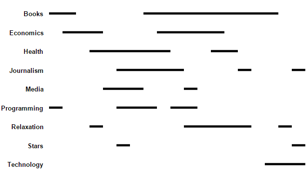
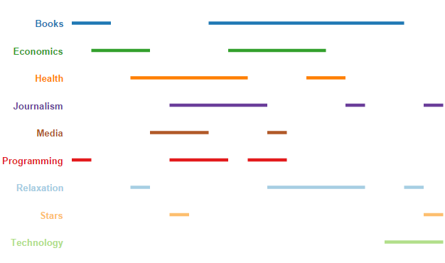
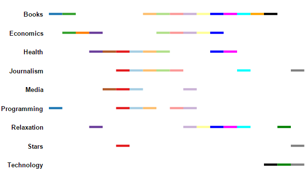
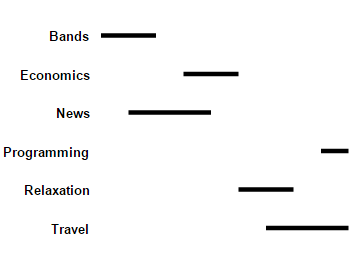
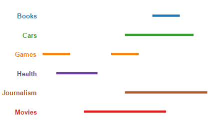
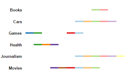
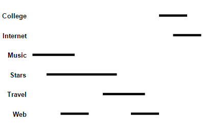
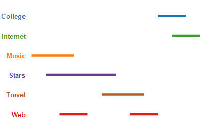
| Page in Test | Question Id | Monochrome Diagram | Colour by Sets Diagram | Colour by Overlap Diagram | Asked Question. For the training questions, this also includes the training text | Options - presented in the form of tick boxes | Correct Answer |
| Page 2 | Training 1 | |
|
|
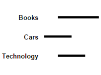
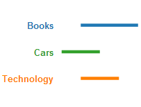
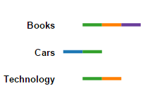
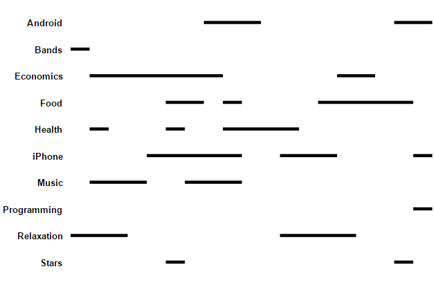
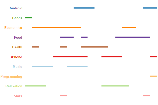
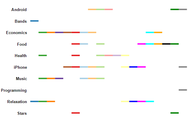
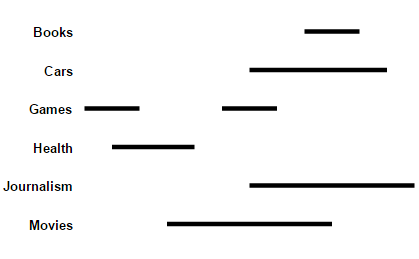
Mono: Set: Overlap: |
,None of the above | Technology |
| Page 3 | Training 2 | |
|
|
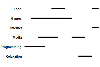
Mono: Set: Overlap: |
,None of the above | Food,Games,Programming,Relaxation |
| Page 4 | Training 3 | |
|
|
Mono: Set: Overlap: |
,None of the above | Economics,Games,HiFi,Music | Page 5 | Training 4 | |
|
|
Mono: Set: Overlap: |
,None of the above | Books,Economics,Health,Journalism,Media,Programming,Stars |
| Page 6 | Question 1 | |
|
|
,None of the above | iPhone | |
| Page 7 | Question 2 | |
|
|
,None of the above | Programming | |
| Page 8 | Inattentive 1 | |
|
|
,None of the above | click on region | |
| Page 9 | Question 3 | |
|
|
,None of the above | Design, Economics, Web | |
| Page 10 | Question 4 | |
|
|
,None of the above | Bands, Cars, Journalism, Music, News, Stars | |
| Page 11 | Question 5 | |
|
|
,None of the above | None of the above | |
| Page 12 | Question 6 | |
|
|
,None of the above | Android, Hifi, iPhone, Journalism, Music, Relaxation | |
| Page 13 | Question 7 | |
|
|
,None of the above | Books, Internet, Music, Web | |
| Page 14 | Inattentive 2 | |
|
|
,None of the above | click on region | |
| Page 15 | Question 8 | |
|
|
,None of the above | Books | |
| Page 16 | Question 9 | |
|
|
,None of the above | College, Internet, Music, Web | |
| Page 17 | Question 10 | |
|
|
,None of the above | Android, Economics, iPhone, Media, Relaxation | |
| Page 18 | Question 11 | |
|
|
,None of the above | Bands | |
| Page 19 | Question 12 | |
|
|
,None of the above | Computers, Economics, Hifi, News, Technology |
The visualizations were generated from source data derived from SNAP Twitter ego networks. The files listed here are from this .gz file: http://snap.stanford.edu/data/twitter.tar.gz.
| Question | Data Source |
| 1 | 74651704.circles |
| 2 | 204145356.circles |
| 3 | 629863.circles |
| 4 | 14199378.circles |
| 5 | 18957524.circles |
| 6 | 163629705.circles |
| 7 | 64508047.circles |
| 8 | 87114066.circles |
| 9 | 34416153.circles |
| 10 | 134943586.circles |
| 11 | 28490110.circles |
| 12 | 7682452.circles |
Anonymised study results in csv format. The time column records the time spent on the question page in seconds. The fraction correct column gives the proportion of buttons in their correct state (selected or not selected). The data here is from the participants who answered both attention testing questions correctly.
Investigators:
Peter Rodgers, University of Kent
Gem Stapleton, University of Brighton
Peter Chapman, University of Brighton